Dip Pen Nibs for Drawing.
How to choose them for your ink and art work. |
We receive quite a few questions from our web sites about dip pen nibs, so to help those seeking information on 'which dip pen nib', I've put together this small section covering the most popular of the drawing dip pen nibs.
Judging which type of dip pen nib to buy and the meaning of 'elastic' is usually the first problem. To sort this out we need to look at the parts of the metal nib and hand pressure, we'll look at nib parts first.
|
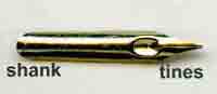
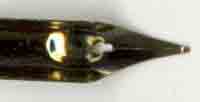
A typical dip pen nib has three main parts: The shank also known as the base or heel - this is the section that goes into the pen holder:
The tip - which is the point of the nib, this is divided by a split, the parts either side of the split are called tines:
The vent or breather hole - the split runs from the vent to the tip.
The 'elastic' is the name given to the response of the tines of the nib, this gives the 'bend-ability', 'springiness' or 'elasticity' of the tines as we use it.
Hand Pressure - we all use different hand pressure when writing, this in turn affects the response of the nib tines to our hand.
You may be wondering - is there any guide to our own hand pressure?
Perhaps the easiest way to check hand pressure is to use a HB pencil and write on a sheet of A4 plain light weight paper (90 g/m² or gms), fold the paper in half before writing. Write a couple of sentences in your normal writing style, with the paper placed on a table top or other hard surface.
Now check the reverse of the paper to see how much it has been 'impressed' by you and the pencil, also check the folded side to see if an impression has been made on that.
If the pressure has caused the paper to be impressed and an impression is showing on the folded piece, then it would indicate a fair amount of hand pressure, often expressed as a 'heavy hand'.
If on checking the reverse side of the written paper, the paper is slightly impressed, but there is little impression showing on the folded half, this would indicate 'normal hand' pressure.
For a person with 'light hand' pressure, there would be very little or no indication of the written paper being impressed.
|
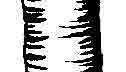 Knowing your own hand pressure helps when choosing the 'elastic' of the nib. The manufactures' write up of the nib is usually related to a 'normal hand' pressure, if you are reading the write-up ofsomeone else, it's best to know their hand pressure, in order for you to evaluate it. I would consider myself to have 'normal hand' pressure - the close-up of an ink drawing on the right shows the 'elasticity' of the Joseph Gillott 170, from fine to wide lines. To see the whole sketch click the link. Knowing your own hand pressure helps when choosing the 'elastic' of the nib. The manufactures' write up of the nib is usually related to a 'normal hand' pressure, if you are reading the write-up ofsomeone else, it's best to know their hand pressure, in order for you to evaluate it. I would consider myself to have 'normal hand' pressure - the close-up of an ink drawing on the right shows the 'elasticity' of the Joseph Gillott 170, from fine to wide lines. To see the whole sketch click the link.
As a general guide - someone with a 'light hand' will often use nibs with 'high elastic'. These nibs are delicate, responsive and easily damaged, it takes very little pressure to bend/open the tines. The nib action often feels 'soft' and 'too springy' for a 'normal hand'.
Someone with a 'heavy hand' will often prefer a stiffer nib with 'low elastic'. These nibs are robust and responsive, it takes more than 'normal hand' pressure to bend/open the tines. The nib action often feels 'strong' and 'stiff' to a 'normal hand'.
For the 'normal hand' just the term 'elastic' is often used, normal hand pressure can bend/open the tines of these responsive nibs, they feel neither 'too soft or strong' and they are neither 'too stiff or springy'.
But, the elastic of the nib often varies slightly from different makers.
I would suggest you try as many different nibs as possible, dip pen nibs are not usually expensive, try for a least three different types that allow you to comfortably express your lines. Any hand pressure can of course use any elasticity of nib, it all about what suits you.
|
Drawing dip pen nibs - now lets move on to the different types of pointed drawing nibs. The pointed nibs are in two main categories, ones that come to a sharp 'needle like' point and those that come to a more blunt point and usually have a rounded nib tip.
|
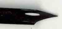 
The underside of a Gillott 303 on the left (needle point tip) and the Brause Cito Fein on the right (rounded nib tip). |
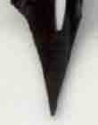 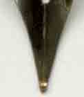
The nib tips are shown in close-up. Notice the sharp, straight points to the tines of the Gillott 303, whereas the Cito Fein has a more rounded, ball shaped tip to the tines. |
If you are looking to produce fine 'hair like' lines, then a sharp 'needle point' nib is the best choice. The rounded 'ball shaped' tipped nibs will give fine lines but not as fine as the needle pointed ones, because the ball tip has a larger area supplying ink to the paper. |
The Joseph Gillott drawing nibs and their equivalent, are often the preferred nib for pen and ink work, also ink drawing. With these expressive nibs you can achieve from fine, hair-like lines to wide 'chunky' lines, but for anyone new to using these 'needle point' nibs, the first problem is the 'scratchy' feel to the nib when in use and for that reason alone many people give up on them.
This is a shame because these nibs are well worth persevering with, especially if you are after those 'fine ink lines'!
Like any new instrument you use, it can be strange and different at first, one way that may help to ignore 'the scratchiness' is to think about what you are doing with the ink and not the nib you are using - that may sound like a strange thing to say - but the more you think about the sound and feel of the nib, the less you think about the marks you are trying to make. The more you use the nib the more it becomes a friend. |
For the related products in our online shop please click the following link,
J and T's Art and Calligraphy, use this link for Vintage Dip Pens, Dip Pen Nibs and Ink.
For more information on the Properties of Ink please use the link.
There is also a page on our Zest-it website that has information about coloured pencils, dip pens and ink on parchment. |